Until recently I never really paid attention to the WordPress sidebar on my website. i had put some social media buttons in it, a list with best read articles.
And to fill it up, I placed a Twitterfeed and a Facebook likebox in it.
Not realising that an effective sidebar is actually a top priority for your website.
I only noticed when I started to get into it…
The WordPress sidebar doesn’t only offer a lot of great options to inform your visitors, but also for call to action.
You can promote products here or get in contact with your visitors.
Left or right?
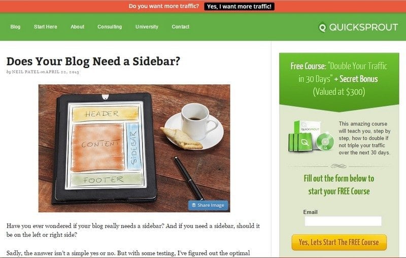
Most websites have the WordPress sidebar on the right side. But you can also place it on the left side. Neil Patel has run various tests on his website with a sidebar both on the left and on the right side. What turned out?
If you place the sidebar on the left side, you get more newsletter subscriptions (if you have placed an optin box) and your biography (a few sentences to introduce yourself – more about that later…) and promotion offers are read better. But Neil also found that his blogs were read 9 percent less.

Eventually he chose a right sidebar, because ultimately it’s about people reading his blogs. Also read his article Does your blog need a sidebar?
 What can you do to improve the sidebar of your website?
Nine tips that will help you.
1. Remove all irrelevant content. You can cram your sidebar with all kinds of content, like a tagcloud, most read articles, comments, social media buttons, etc. But less is more.
The less social media buttons you place, the attention that one button will get.
Use your sidebar to achieve your goal. So only use content that is really necessary. With a long sidebar the visitors won’t see the forest for the trees.
2. If you have a newsletter, then place the optin box prominently in your sidebar. Gathering email addresses is often one of your most important goals, so you need to put it in the spotlight.
The sidebar is a great place for this. Make sure you have a colour that stands out. If your page is predominantly blue and grey, then you should make your optin box orange or another deviant colour.
3. Don’t place too many embedded links in your sidebar, this can slow down the website. The Facebook likebox, a Twitterfeed but also a Youtube video all work with embedded links. You place a link in the sidebar and the likebox or feed appears.
But these links can slow down the website. So don’t use too many, because you don’t want visitors to leave because your website is too slow.
You also lose your visitors faster when they are diverted to a social media network because they are distracted and might not return to your website.
Also don’t use too many advertisements. You can measure how often an advertisement gets clicked on. If nobody clicks on it for a month then get rid of it. It doesn’t add anything.
If you do place them, then make sure to load them in a new screen (with the ‘target=_blank’ code). Your website will load faster because of it.
And make sure you place banners that suit your website. If you have a blog about gamers, you shouldn’t place advertisements about mortgages.
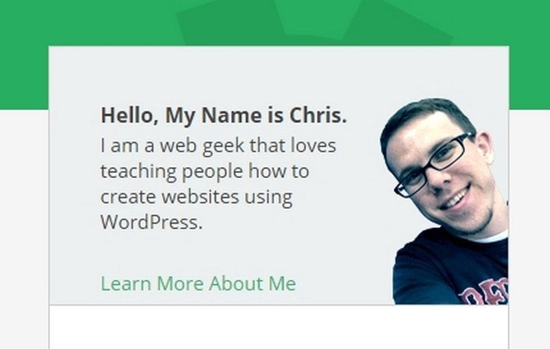
4. What should also be on your blog, and preferably in the WordPress sidebar: a block where you tell a little about yourself or your website. You can often make this clear with only a few sentences. Don’t only tell about yourself, but also about how you can help your visitors with their problem.
If you want to tell more, then add a ‘read more’ at the bottom with a link to a new page with details about yourself. It has become evident that these ‘read more’ pages are amongst the best read pages.
Your audience wants to know who is behind the website. This is how you make it more personal. Visitors are more inclined to listen to a person then to a website.
Photo in WordPress sidebar
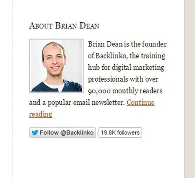
Of course a photo of yourself makes it even more personal. Use a photo that shows who you are. For some this is more formal and others more casual.
How this looks in practice? I’ll give you two examples. You can for example write a bio using the word I. That makes it personal.

Below you see a bio of Brian Dean, who presents himself a little more ‘distant’. But he is an authority in internet marketing and this way he can tell a little about his services.

5. Make your own adjustments to your WordPress sidebar. It’s not hard. In your text widget you can use html to make headers, bold letters or add colours. Here you can read an article by WP Brian about the html basics.
6. Place something special in your sidebar. An eBook that people can order, or a list with all the bloggers that are working on the website.
Another idea for something special you can find on the website of the Internet Marketing University which has placed a Content Canon in the sidebar. It often gives more traffic, but it’s also good for SEO. And it’s special!
7. The best read articles is also still a trigger. People are just curious and what to know which are the most popular articles.
Apparently there is a need for that, so place them prominently in the sidebar. And popular articles become even more popular because of it… A list with the last comments also always works. This shows that your website is interactive, that it’s alive.
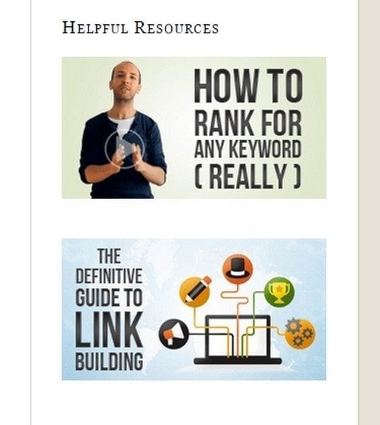
8. Use nice illustrations. Prevent placing too much text, you can replace it with banner images. Brian Dean has created special banner images to promote something:

9. Use a smart sidebar. My theme has a built in smart sidebar. This sidebar automatically moves along when scrolling down.
I am not really a fan of this so I haven enabled this function on my website. But others swear by it and think it is a great solution.
Landing page
Just this: You don’t always have to add a WordPress sidebar. If you want to make a landing page that is specifically aimed at one thing, then a sidebar can distract. Also on front pages you don’t always see a sidebar.
Well, I hope these tips will help you to pimp your WordPress sidebar. The power and effectivity of the sidebar is underestimated; when this spot is very important to draw attention.
Don’t wait any longer and look critically at your sidebar.
Have you also seen suggestions or examples of a good sidebar? Let me know in the comments!


