Google announced it a year ago: we are going to implement Mobile first in our search engines. In the spring of 2018, Google will make this change to its search engine algorithms. And that can have major consequences for many websites.
I have also taken the necessary measures to be prepared for the arrival of Mobile first. My two most important websites, including WPjournalist, have a mobile-friendly theme and are considered by Google to be mobile friendly. I’ll tell you in a moment how to check this with your own website.
In addition, you can make your website suitable for Accelerated Mobile Pages (AMP), a technique that allows your website to charge mobile devices four to five times faster than usual. Google itself introduced this technique and you understand that they regard AMP as a big plus in order to get higher in the search results.
In a moment I’ll also tell you more on how to implement that in your website.
What exactly does Mobile First mean for websites and what consequences can it have for your website? And how can you prepare your website for Mobile first? You can read all about it in this article.
Mobile first for websites
While browsing the internet, I see so many interesting websites that are not yet prepared for Mobile first. And I find it a pity. No matter how good your content is, if your website loads slowly or is not visible on your iPhone, your visitors will leave.
We have long seen the trend that people are increasingly consulting their mobile phones in order to find something. According to Statista, this now accounts for more than half of all online traffic. Google (and also the other search engines) have not failed to notice this. Previously, they were focused on the desktop version (shown on your computer) of your website, but they base the indexing of their search engines on the arrival of Mobile first on tablets and smartphones.
This is an enormous turnaround.
And rightly so, because when visitors go to your website via their smartphone, they want to get to the point quickly and have a good user experience.
It means that websites must be well optimized for smartphones and tablets. If that is not the case, there is a good chance that your website will appear lower and lower in the search results.
Of course, Google will still index you, but they will not give you priority if another site is more mobile friendly.
In the meantime, Google has been gradually introducing Mobile first over the past year. But this spring there will be a hard transition. In the Google Search Console, you will be informed that your website is insufficiently prepared for Mobile first. But it’s better not to wait for it, it’s a matter of taking action yourself.
Mobile Friendly Test
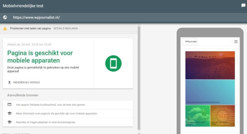
The first step is to see if your website is mobile friendly. Google itself has developed the mobile-friendly test for this. When you test your website, you will see the following result:

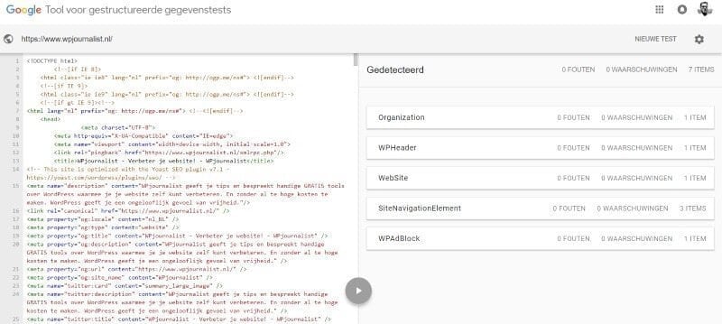
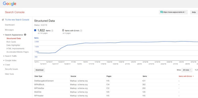
If you want to double check this (you don’t have to, this is for the more advanced user …), you can also use the Tool for structured data to test your site for errors. The Google Search Console is also a way to see how your website is doing. In Search appearance > structured data, you can see if there are any errors in your website.

This is the tool for structured data from Google.

In the Google Search Console, you can see how the structured data is doing.
In the Google Search Console, you can see how the structured data is doing.
If you see any problems, the Search Console can help you solve them with a step-by-step plan. Often this does require some technical knowledge.
With existing – outdated – websites, it’s quite a complicated job to make your website mobile friendly. But you can try it with a WordPress plugin. I will mention two: WPtouch, which can be downloaded free of charge from the WordPress catalogue, and Touchy. The latter is a paid plugin.
Sometimes it goes flawlessly with these plugins, but it can also happen that your website is too outdated, resulting in these plugins no longer working properly.
Hey, and before you use the plugins, first make a backup of your website!
Responsive website
If you do not succeed in adjusting your website with a mobile-friendly plugin, there is only one solution left: a new website.
There are many people who aren’t keen on building a new website. But this may be a good opportunity to do so.
Nowadays, all the WordPress themes you buy are responsive, which means that you are clearly visible on a computer, tablet, and smartphone. A good address to buy responsive themes is ThemeForest, where hundreds of professional themes are offered. I myself make a lot of use of it. Here are a few specific themes with which I have had a good experience:
- Avada, the most sold theme of ThemeForest;
- BeTheme, with which you can create customized websites very well;
- Newspaper, the most selling magazine theme of the moment;
- Bridge,a beautiful and stylistic creative theme.
Make your website faster
[bs-quote quote=”53% of all mobile visitors leave the website that has been loading for more than three seconds.” style=”style-13″ align=”left”][/bs-quote]
The website does not only need to be visible on mobile devices, it also needs to load quickly. If a visitor has to wait too long for a page to be loaded, he or she will leave more quickly. So when making your website Mobile first, you also focus on speed. In the popular article: In 11 steps from a snail’s pace to a super-fast website, you can read how to do that. By making a number of adjustments, you can make your website considerably faster. Vroommm … Often with a plugin or a few small adjustments, you can improve your website a lot.
There is also a tool for this, which measures the speed of your website, Google Speed Insights.
Google AMP
In the introduction, I already indicated that Google itself also develops techniques for faster display of pages to their visitors. They have developed the Accelerated Mobiel Pages (AMP) , which allows pages to be loaded up to four times faster on smartphones and tablets.
AMP is a relatively new technique and is far from being established. It has the advantages of a faster website, but it also provides a different layout. All ‘heavy’ elements on a website are filtered out, so that things may be missing on your website if you use AMP. Also, the design is often a lot simpler.

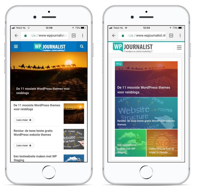
Here you can see the difference between a mobile phone with AMP (right) and a mobile phone without AMP (left). You can see that the layout of the website is very different when using AMP, often simpler and more austere.
Therefore, AMP is not suitable for all websites. Content publishers often use AMP, because they are focused on articles and articles often do not require an extensive layout.
If you want to introduce AMP into your website, you can use a plugin. Such a plugin is, for example, AMP for WordPress, developed by Automattic, the owner of WordPress, so a good source.
But here it also applies that a plugin can cause problems to an existing website.
Even better is to buy a theme that incorporates AMP. Then you don’t have any problems with the compatibility, meaning that the theme and the plugin don’t work well together. For WPjournalist I use the theme Publisher, which includes AMP. Publisher also uses a plugin, Better AMP, but the advantage is that this plugin is completely attuned to this specific theme. And therefore it’s easy to enable AMP.
In the customizer of this theme, you can customize the layout/design of the AMP website. There are still quite a lot of possibilities: different colors, layout, links, etc. AMP is not always an improvement. The page may be faster to load, for example, but the design may be disappointing. And that is also important for the user experience of the website.
Conclusion
AMP, plugins, another theme; there are several possibilities to prepare your website for the arrival of Mobile first. Sometimes a few minor adjustments to your website are necessary, but sometimes also major changes.
If you have an outdated website, now is perhaps the time to redesign your website. At ThemeForest, the first themes with which AMP is integrated are already for sale.
For me it was also a big step to choose for AMP. But now that I’m seeing how fast the pages and articles are loading, I’ve decided to use AMP for my two most important websites.


